A lot goes into making a great event. Whether it’s finding the perfect speaker, the perfect workshops, or the perfect space, everything has to be just right. When all that’s done, however, there’s still the equally important task of promoting your event, and the event website is central to that challenge.
If your event website is too vague, too boring, or too crowded with information, it can push potential attendees away rather than bringing them in. What makes a great event website? It’s a combination of personality, usability, and content.
An effective event website is eye-catching and entertaining, but also simple to use and effective at communicating the pertinent details of the event. It’s no use piquing a visitor’s interest in the event if they also don’t also get the practical when, where, and how of it. People draw conclusions about sites they visit very quickly, so it’s important to make a solid first impression.
Here are five examples of event websites that get the job done.
DMA &THEN
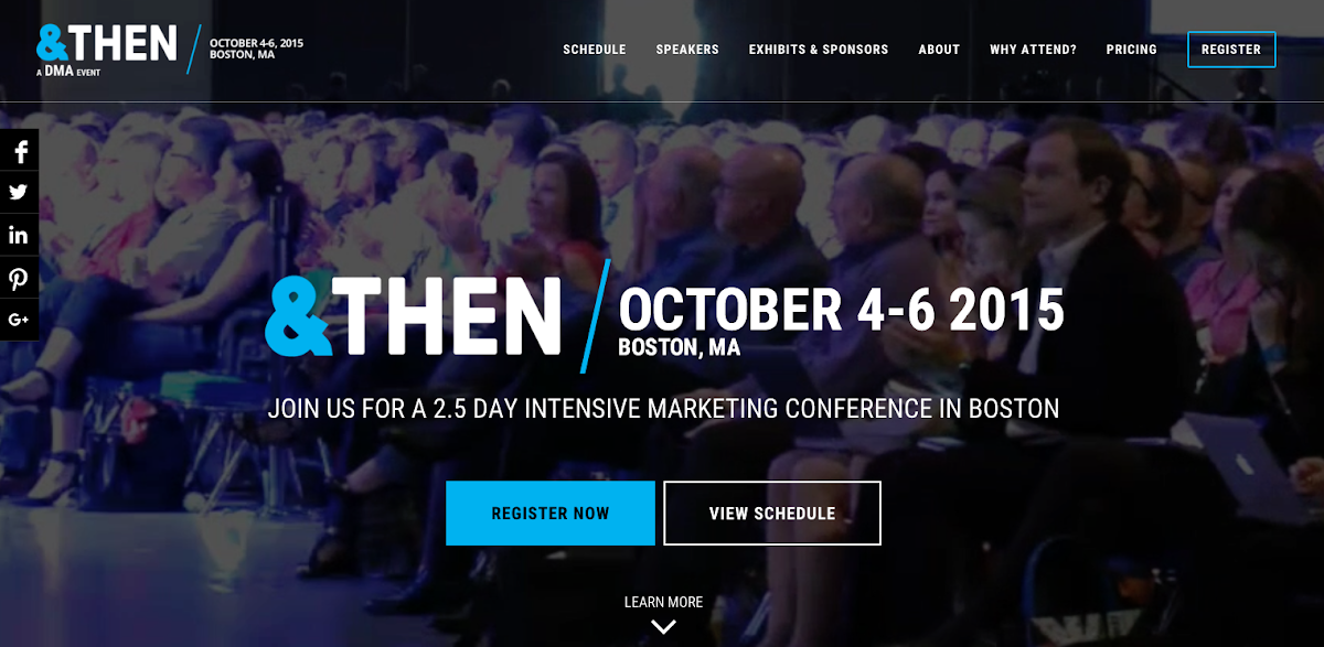
DMA’s &THEN conference website is beautiful. The home page features a non intrusive looping video background, a prominent call to action, and whether you opt for the navigation bar or to scroll to learn, you won’t be searching long before you find what you need to know about this event. The design overall, with it’s black, white, and blue color scheme, is simply bold and clean. Is there anything Earth shattering or very new and different that we haven’t seen on event websites before? No. But the site does what it needs to do and it does it very well.
Personality: 8/10
Usability: 10/10
Content: 10/10
Coachella
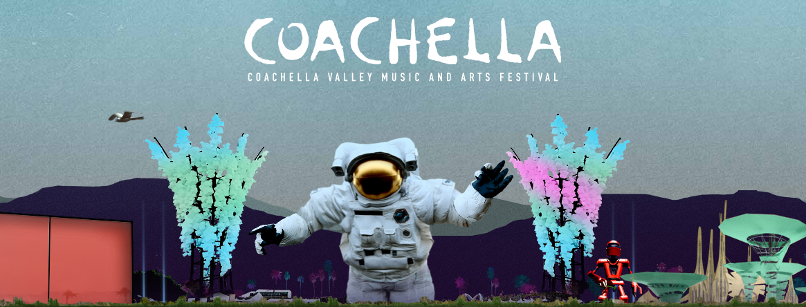
The Coachella FAQ page features a beautiful animated header, but the content is all business. Potential attendees need to know how Coachella’s policies about festival passes, camping, and parking work in order to make decisions about their trip. The navigation bar at the top of the page is simple and clear. An event like a music festival can be complicated because of the sheer volume of attendance, but Coachella makes sure to lay all the information on the table so visitors to the site can easily locate what they need to know.
Personality: 8/10
Usability: 8/10
Content: 9/10
Dreamforce
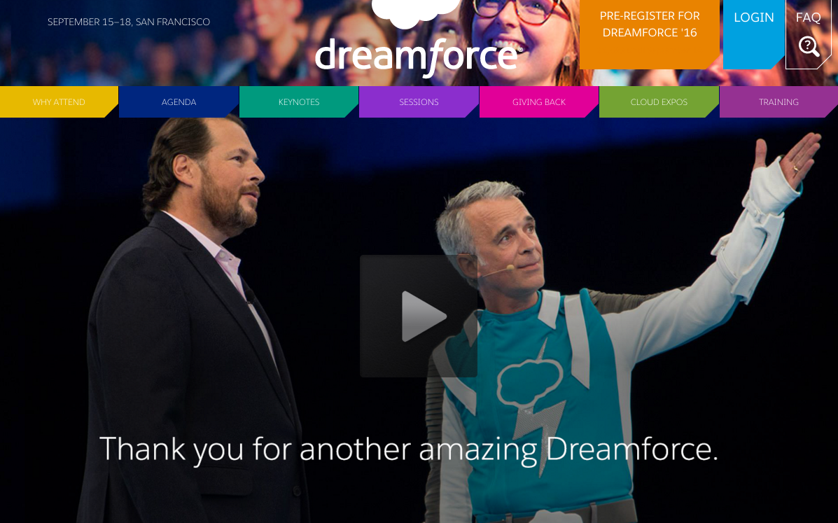
The Dreamforce site is colorful but not overbearing, with great use of video. Visitors can watch highlights from this year’s conference, check out the agenda and the keynote speakers, or read the persuasive “why attend page.” If this content convinces them that the event is something they’d like to attend, visitors can then click the link to pre-register for next year’s conference from anywhere in the site.
Personality: 7/10
Usability: 7/10
Content: 8/10
Bedstock
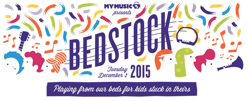
Bedstock is an online event which features both artists and kids playing music from their beds in order to generate support for MyMusicRx’s programs for bringing music to children battling serious illnesses. The most prominent feature is an eye-catching video collection, and, instead of leading to new pages, the links in the navigation bar help the user jump smoothly around the site’s single page. These features make the site entertaining while remaining simple.
Personality: 10/10
Usability: 9/10
Content: 9/10
Google I/O
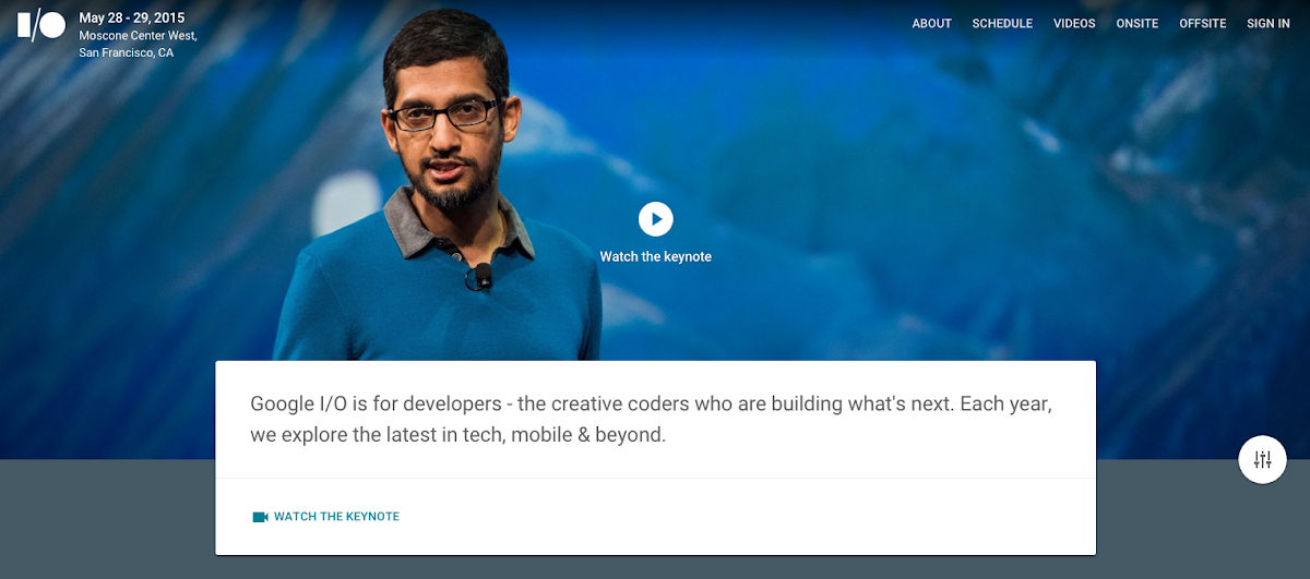
Google I/O is an event that celebrates the cutting edge in developer-land and explores what’s next. For that reason, you can imagine Google I/O would have a nicely developed website, and they do. Google I/O’s 2015 site is clean, modern, mobile, fast, and friendly. Just what you’d expect of Google. The event content you need is exactly where you’d expect it to be, the animations and page loads are clean and quick, video overlays are flawless, and community engagement is woven throughout.
Personality: 8/10
Usability: 10/10
Content: 10/10
Conclusion
An effective website is key for generating interest and getting people informed about your event.
Usability and content should always come before a fancy design, but the site should also communicate the personality of your event. A visitor should be able to quickly scan the home page and understand what the event is, when it’s happening, and where they can click to learn how to attend.
A great event deserves a great website, because a great event deserves great attendees.