We’ve touched on what makes a great event website in the past, noting that a smart combination of personality, usability, and content are central to nurturing a prospective community of attendees. Beyond the information though, an event website has to be intuitive to navigate, and of course, jaw-droppingly beautiful.
Your website is often the first touch point between your audience and your event. First impressions are lasting impressions, and when a potential attendee visits your event website, they’ll immediately notice a few things. Did you make it easy for them to find the information they need to support their decision-making process? Is the website aesthetically pleasing?
Not everybody knows how to design a beautiful website, but everybody knows a beautiful website when they see it. Those first impressions of your event website or microsite carry over as expectations for your event. So if your website is well thought-through in support of the attendee journey, and it’s gorgeously designed, your audience will feel reassured that the event will play out just as smooth and enjoyable.
These 10+ events nailed the event website:
LIVEWORX
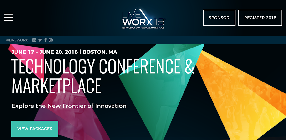
The LiveWorx Technology Conference & Marketplace website features a visually stunning landing page with very obvious call to actions. Of course you can’t see this in the screenshot above, but those shapes move responsively with where your mouse travels across the page, and inside them, have video from the conference looping. It’s subtle. The video isn’t in your face, but it provides a textural feel for the attendee to know what they are getting into. And if you scroll down, the very first thing you read are the top 6 reasons to attend. Well done LiveWorx, we’ll be there.
DREAMFORCE
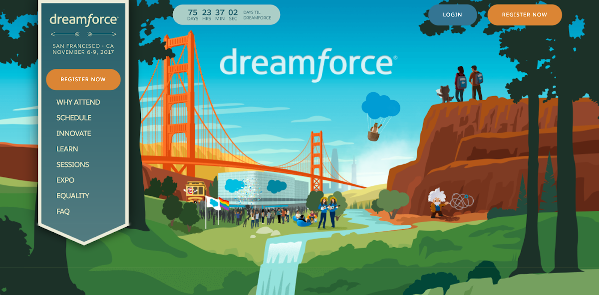
Dreamforce by Salesforce just looks dreamy doesn’t it? Is it the Wonka Factory? Is that my bucket list in a picture? Oh, it’s Dreamforce. Their animated landing page provokes emotion and just makes that look like a place you want to be. I mean c’mon, there’s a bear riding in a Salesforce logo hot air balloon. And as you scroll down the page, you follow a trail to all the content you may need to sway your decision that this is the conference you should be attending.
GOOGLE I/O
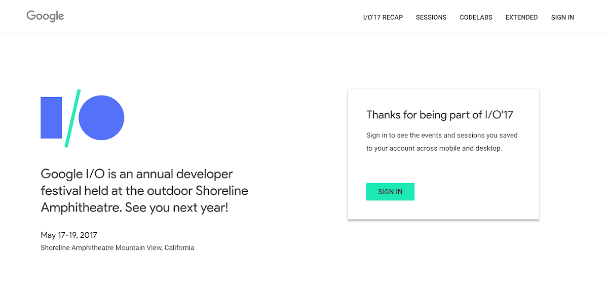
Google I/O made a very Googley event website. Lots of white space. Smartly designed accents as to how the “/” in the I/O moves. The animation isn’t distracting, but instead is complimentary to the look and feel of the show. They have links off to Google Developers console and the Google+ I/O community, and very nicely tiled, easy to navigate session info and Codelabs sessions. We love this site because it balances minimalistic design perfectly with still providing all the necessary info to attendees.
TED
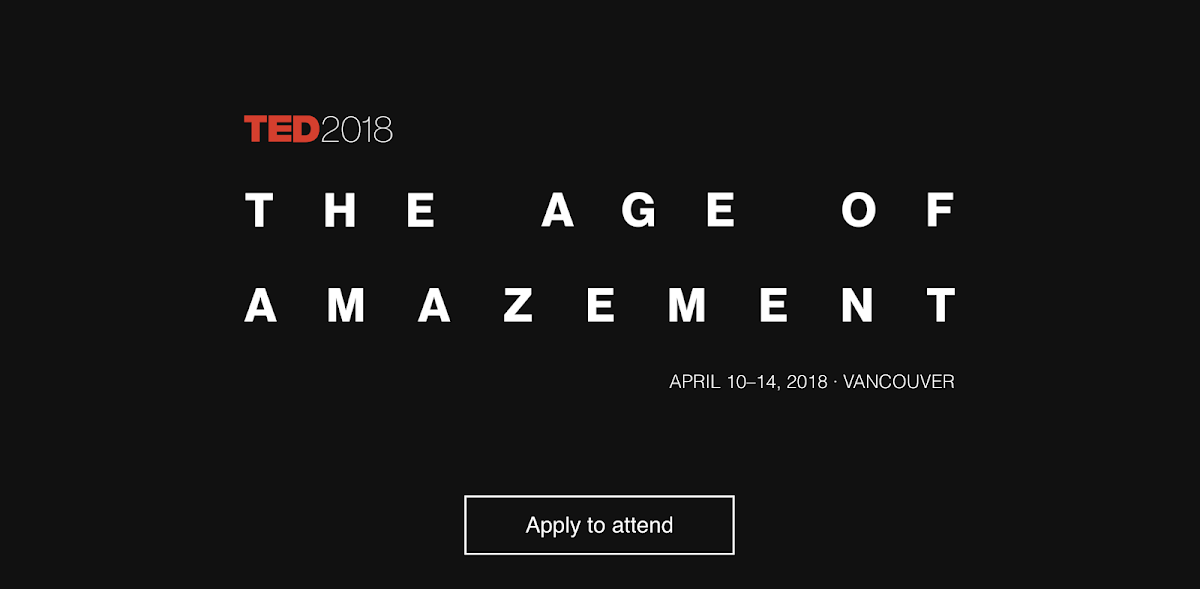
What would you expect from TED but big space for big ideas. They built their event website like a stage. They are experts at crafting powerful opening statements and they did just that for their next TED Conference. The other appeal to TED, beyond being in the same room with some of the most brilliant minds in technology, entertainment, and design, is that you must be accepted to attend. And you must have many thousands of dollars. This is a seriously exclusive event, and in a way, this bold black emptiness of a website landing page communicates that. When you scroll down, it’s got the sessions, the days, the date, the location, the pictures, all the must-haves, but honestly it feels more like a membership site than a conference registration. And that’s a great way to build a real community!
DMA &THEN
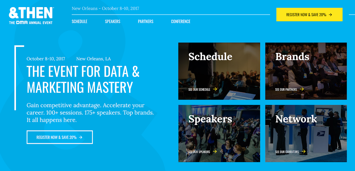
DMA’s &THEN event site gets more beautiful every year. With their smart and simple layout, you can easily discover the session tracks and speakers, and what to expect from the thought leaders. The brands behind the event are prominently displayed so attendees know who they’ll rub shoulders with. And most importantly, they have a very strong positioning statement working as a powerful call-to-action, which we’re sure, converts.
SUNDANCE
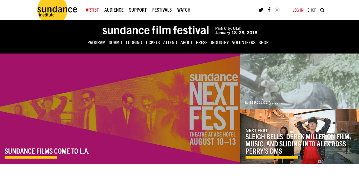
Sundance. The festival of film festivals. Where storytellers around the world come together to celebrate, art, vision, narrative, and passion for the craft that is film-making. And also where A-list celebrities do indie dramas for a third their pay to earn industry street-cred. What works so well with the Sundance website is that is has become a publication of its own. You can go to the Sundance site every week for the year leading up to the event and continuously discover the latest news about films, directors, actors, releases, awards, and more. It serves as much more than a festival registration page, but more of a community and content hub with an on-demand library of past festival films to watch, and proof in the pudding so to say of why to attend the next event.
INBOUND
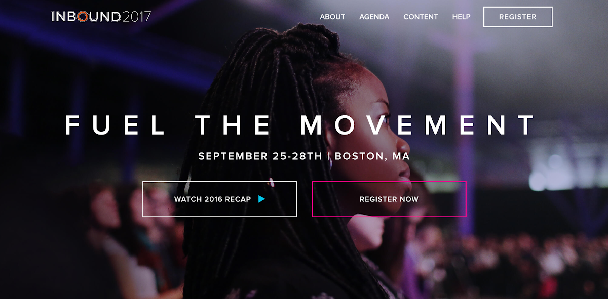
If you were to do a sketch of what an event website should look like, or make up a list of what it should have, your list or sketch might look like Inbound here. Inbound’s event site is as simple and beautiful a model of what a standard event site should be. Watch a video with all the excitement from last year’s event, see who’s speaking and what their talking about, browse the content library with slides and topics, check out the schedule and sign up for updates, connect on social, and register. It’s all there. Did you read the “Why attend?” Then you’re likely going.
SUMMIT
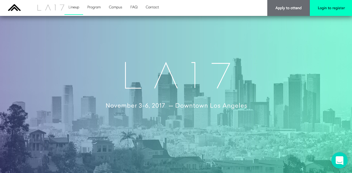
Summit’s flagship annual gathering looks cool at a glance right? Minimalism and line art, check. Gradient, check. Easy to navigate, check. But scroll down and what’s truly impressive is the seemingly endless tiles of speaker, DJ’s, comedians, singers, poets, dancers, artists, etc. you name it. It feels like not only some of the industry’s top names, but all of them, are going to be at this event. Summit is mindful of their attendee needs and understands that this roster is the main draw for their event. So they basically built their website around these profiles. Smart. Time to apply.
DESIGN WEEK PORTLAND
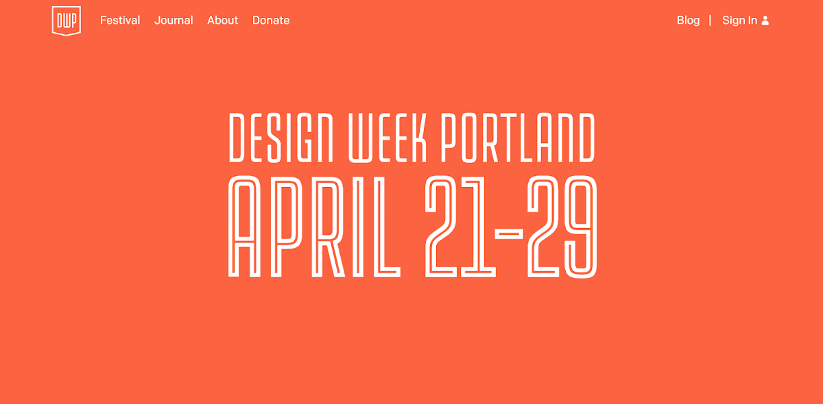
The Design Week event website better be nicely designed right? Rest assured, it is. The website is cleanly built, with itineraries and schedules, open houses and categorized events, partners, patrons, collaborators, and more, just a click away. Their Journal is really our favorite part of the website, with magazine styled issues supporting the mission and vision of the event and the culture they are cultivating.
EPICURRENCE
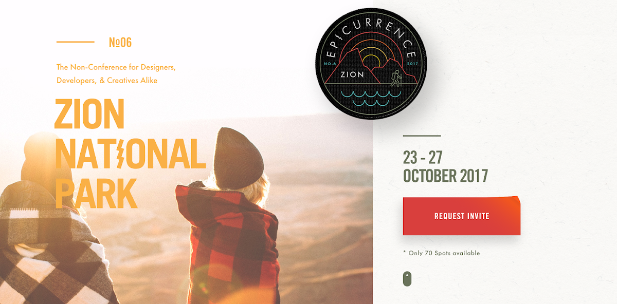
The first thing we notice about Epicurrence, beyond clean design, is that it’s an invite-only. That communicates exclusivity right off the bat, which appeals to the FOMO (fear of missing out) in all of us. Not only that, but they blatantly state how many spots are left for the event—70. That plays to the scarcity principle. You don’t even have to scroll to learn more before feeling like maybe you should request an invite, because soon there may be no more spots! And at least if you request an invite, and get accepted, you can decide to go or not. So maybe, just request one, right? And bam, they either got an attendee, or a warm lead. Smart strategy! But actually, if you do scroll, the website is stunning and the event looks really cool. We may have to request an invite…
COACHELLA
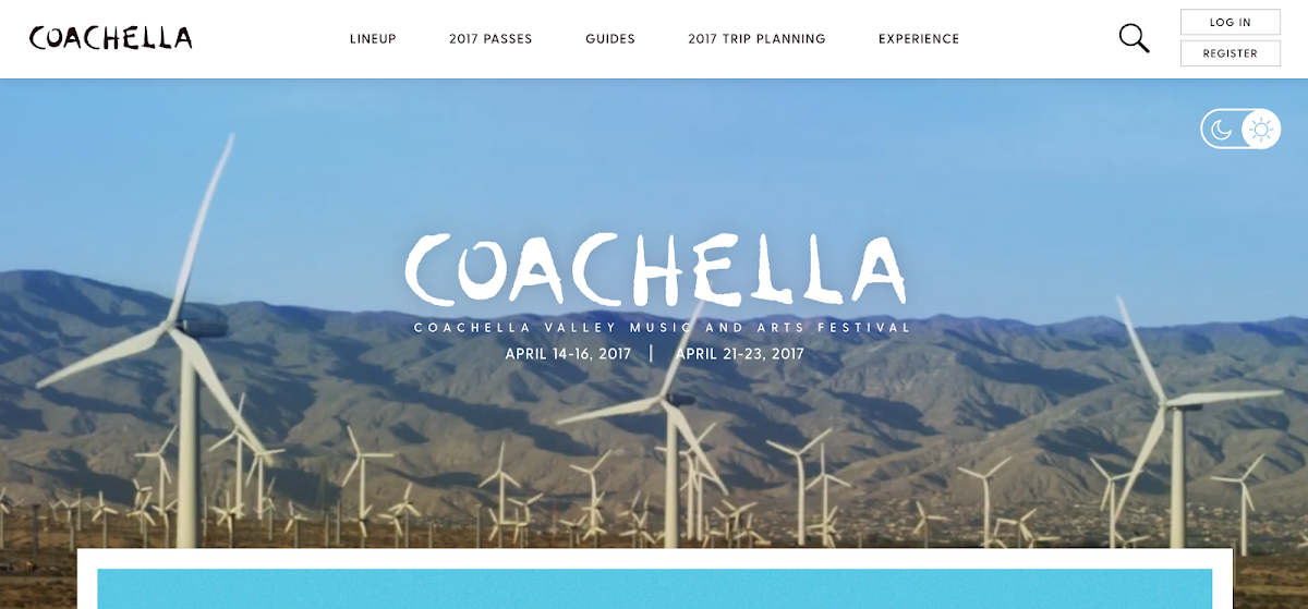
Coachella has a very attractive landing stage on their event website, with a non-intrusive looping video in the background providing context for the festival environment. Upon scrolling though, the magic of this site unfolds. The “Essence of Coachella” flip book, social feeds, and Coachella Guides. Everything you could possibly need for the event, in guidebook form.
- Navigating the purchasing process
- Set times
- Festival maps
- Off-site camping
- Food and drink
- Accessibility
- Lost and found
- Parking
- Rules and FAQ
- Sustainability
- Getting there
They literally thought through it all, and put a lot of effort into providing attendees, both prospective and certain with all the information they need to make the most of the experience.
SXSW
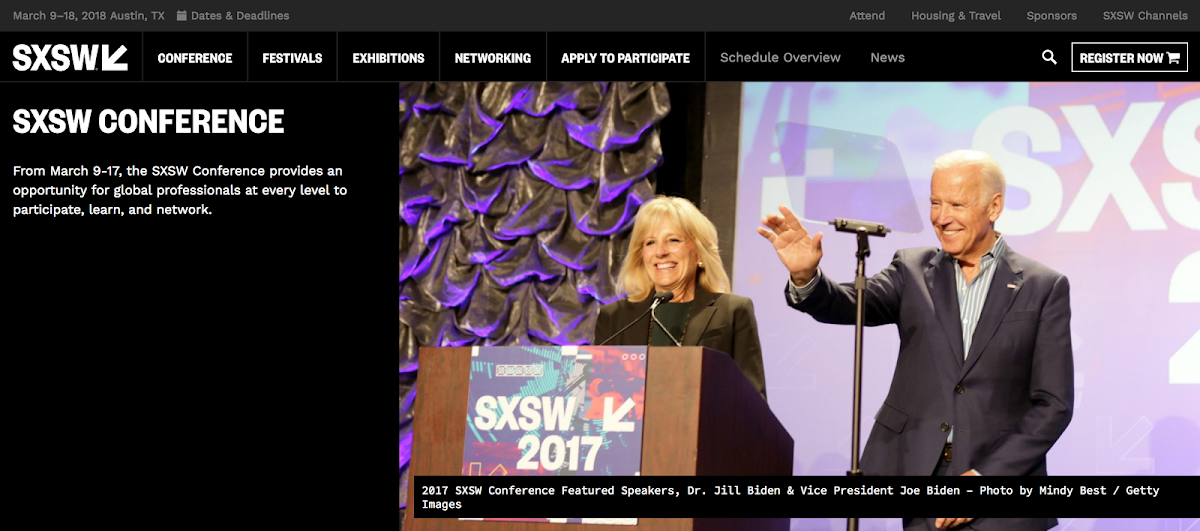
SxSW continues to stay on top of their game, from both an event and an event website perspective. Their event site feels just like their event. A place where entertainment, culture, and technology collide. They do a great job laying out conference tracks, and providing information for attendees, sponsors, and exhibitors alike to discover the content they need to plan their experience. Also, their new Panel Picker allows attendees to vote on session ideas, further personalizing their event experience. A great way to engage the community before the event!
How to have a best in class event website
DMA’s &Then conference, Coachella, Dreamforce by Saleforce, these events made our last website roundup and they’ve done it again. Their commitment to beautiful, intuitive design, and having the right content in the right place, certainly helps. And over the years, it’s obvious they’ve put thought into how to continue evolving and optimizing their event website to engage the widest audience possible.
The bottom line with your event website, is don’t think of it as much different from a Facebook video or YouTube ad. You have a very short window of time in which to capture your audience’s attention, and convince them to stick with you to learn more. At a glance, after landing on your event website homepage, a prospective attendee will very quickly form an opinion of your event and if it feels like the right investment of their time, attention, and hard earned dollars. If you can keep your viewer on the site exploring, be sure they can easily find everything they need to decide, “yes, I will attend.”
Download our list of event apps to find what you need.